What’s a “live illustration” and why does it matter?
Ok, so the New York Times doesn’t actually have “live illustrations”— the term I’m using to describe an editorial illustration that is not just made from code, but more importantly, is directly implemented as such. The status quo is limited to static image or motion files, which do work quite nicely! However, the small selection of live illustrations here (accidentally!) exhibit an exciting profusion of new possibilities for illustrations that truly connect with the reader. Let me explain.
As a designer whose primary medium is code, I make as many of my illustrations as possible using code, and I am perpetually committed to the pursuit of discovering what more opportunities code provides to the creative community. So when I started making these illustrations using code, I did so only because that’s my most comfortable medium. However, the more illustrations I churned out the more it became abundantly clear that using the benefits of code simply opened up more crucial opportunities for the illustrations as editorial pieces, and in many cases, could allow reader to directly engage and experience the themes and narratives described in the article, driving empathy and strengthening the overall illustration. Tactics include interactivity, being driven by real live data, endlessness, and much more.
New York Times illustrations often have an urgent turnaround time, which may explain why the newspaper hasn’t explored the option of live illustration just yet. However, code-based does not mean slow. The illustrations you see here are 100% built with code, all designed and built within the time period of the commission, which is often limited to 24 hours or less.
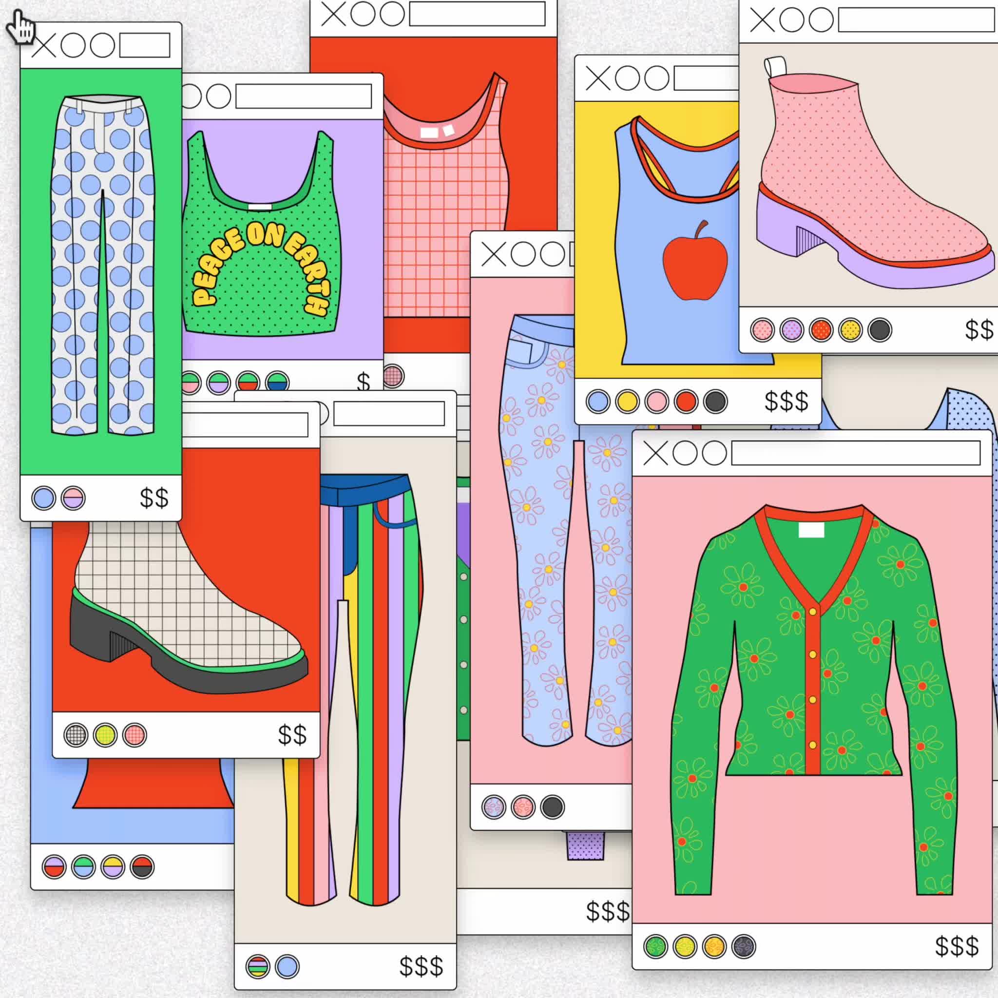
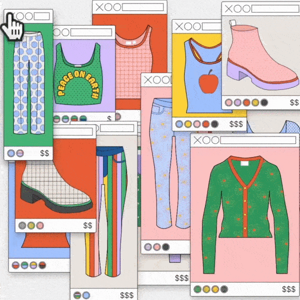
Our In-Person Shopping Hurts Big Tech
We’re now buying less online than many had predicted, and it’s throwing tech companies and the economy for a loop.
How coding makes a difference:
The article describes how people’s rising disinterest in online shopping is having a negative impact on Big Tech. The illustration depicts the user’s disinterest: a moving cursor vigorously “X”es out of online shopping tabs and windows, ultimately “X”ing out of the whole illustration and starting over again.
The premise of the article focuses on users’ interactions within the digital (namely, web-based) realm. This, alone, is reason enough for an interactive illustration! But more importantly, by allowing the reader to engage in the illustration and essentially mimic the actions of the user described in the article, it brings the reader through a similar emotional journey as the article-user and in turn simply makes for a stronger editorial illustration. Additionally, by relying on a new random placement of the windows after every “round” of “X”ing, it gamifies the experience, keeping it fresh and holding the reader for longer.

Technology
- Javascript (Vanilla)
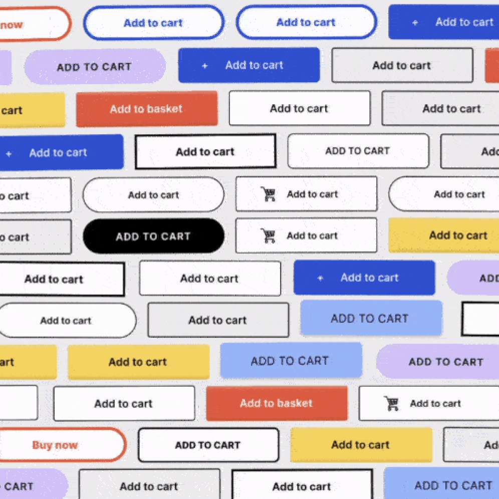
Our In-Person Shopping Hurts Big Tech (Alternate Solution)
We’re now buying less online than many had predicted, and it’s throwing tech companies and the economy for a loop.
How coding makes a difference:
As an alternate illustration to the above article, it shares many of the same motives for being a live, interactive illustration. (Above all: that the premise of the article focuses on users’ interactions within the digital realm.)
While the above illustration entertains the aspect of the article that involves the user’s disinterest, this illustration has more of an emphasis on its effects, namely, its negative impact on big tech. The illustration depicts a brick wall composed of “buy now” buttons, which gradually crumbles and eventually falls down entirely as a metaphor for Big Tech. Clicking a button makes it disappear, weakening the wall and eventually causing it to fall down entirely.
Making the buttons interactive makes the user an active agent in the gradual weakness and ultimate collapse of the “tech wall”. By giving them control, it not only makes the illustration more engaging, but it puts them in the shoes of the user described in the article and allows them to feel the tension that is created as a result of their purchasing actions.

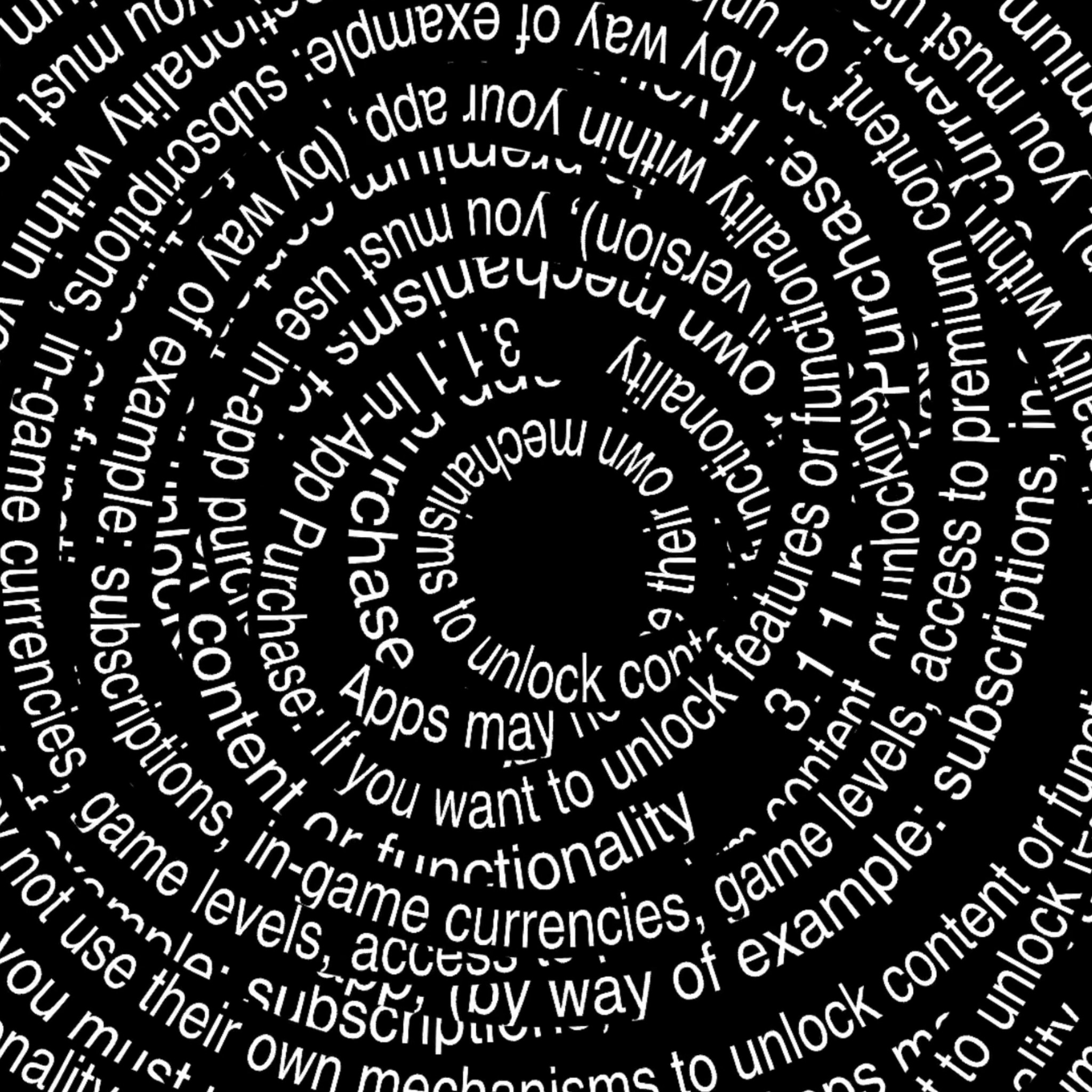
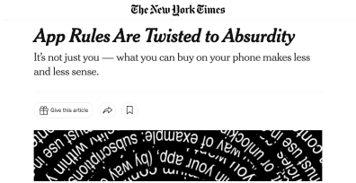
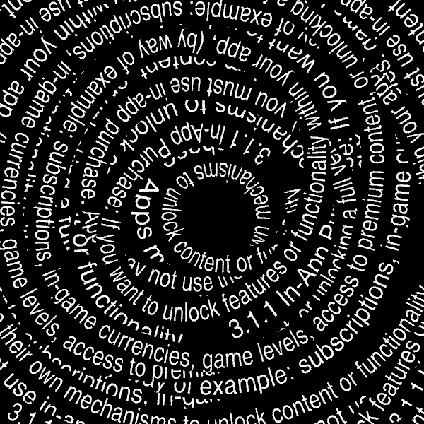
App Rules Are Twisted to Absurdity
How coding makes a difference:
This illustration is not interactive, but it still demonstrates several strengths from being live (which, in a way, interests me more). The text used for this illustration is an excerpt from the Apple store’s Terms and Conditions. To allude to the complicated nature of the text as described in the article, it spirals inward into a seemingly infinite, knotty spiral. However, as a fixed motion piece — a gif or movie file with a defined start, and end — it cannot be never-ending; there is a definitive start and stop, whereby the illustration awkwardly cuts in the middle of the spiral and starts over again.
Using a live illustration opens the door for something infinite. Since the text is looped through according to an algorithm, it can essentially handle any length of text for any period of time. This doesn’t just mean the excerpt chosen for the sketch can instead be, say, the entire terms and conditions (which would also be nice for accuracy). Once infinity is enabled on the sketch, it better echoes select themes of the article (namely, that the terms and conditions go on and on), and more closely evokes the article’s overwhelming tone.
Technology
- p5.js
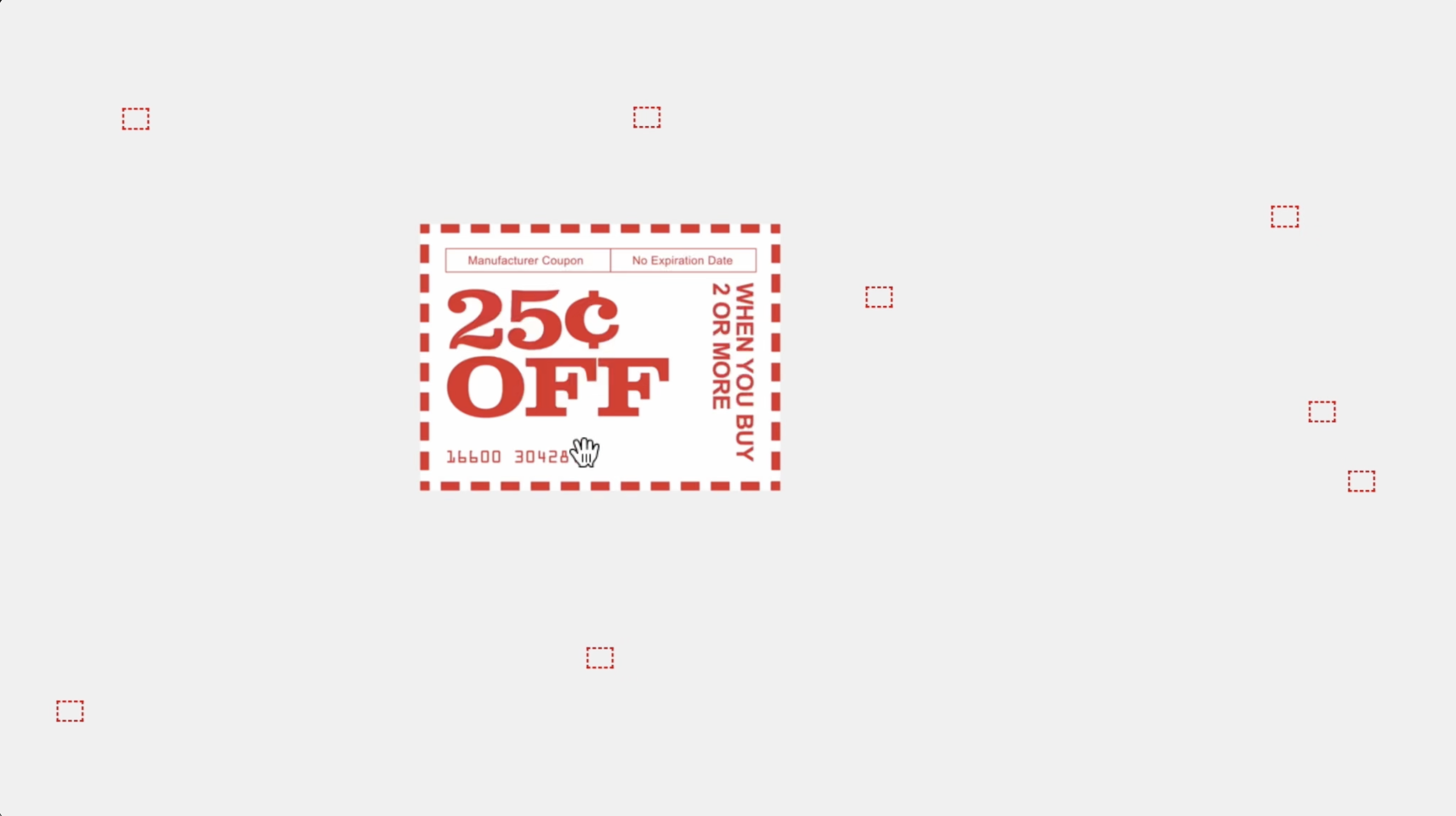
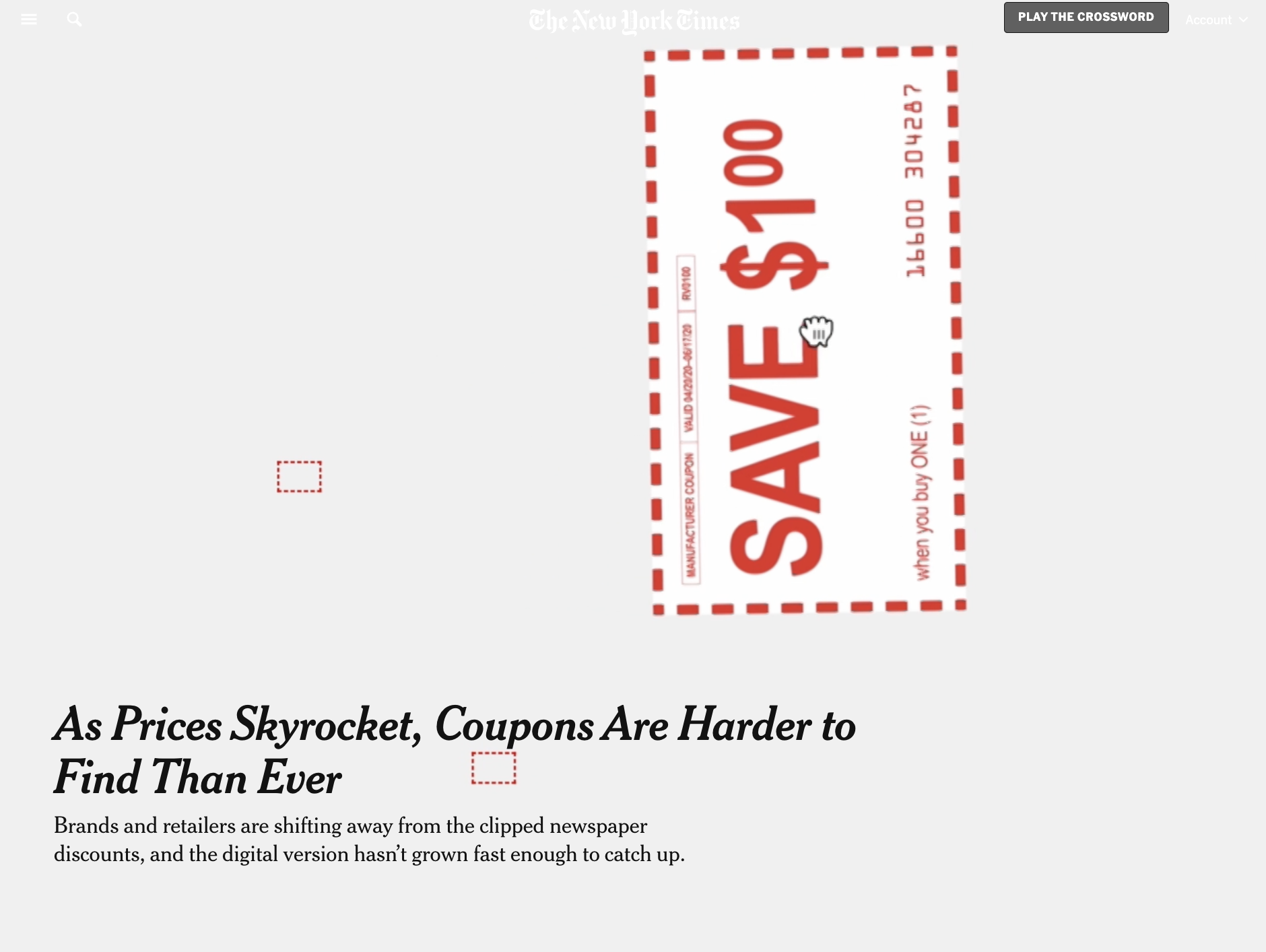
As Prices Skyrocket, Coupons Are Harder to Find Than Ever
How coding makes a difference:
In the sketch, a custom cursor with a magnifying glass peruses through an empty field of tiny blank rectangles, investigating each one to see if there’s a catch: a found coupon. Occasionally there is one, and the cursor grabs the coupon and drags it off screen.
Personally, I think the sketch is almost begging to be interactive. Symbolically, involving the readers as the agents in this sketch is practically a necessity to allow them to experience a similar emotional journey as the users described in the article. The readers can search for coupons themselves, feel the frustrations when they don’t find one, feel the satisfaction when they do, and feel the sense of reward when they are able to grab the coupon for their keeping.
That’s the gist, but the list goes on of reasons to make this one live: a the headline that alludes to somewhat of a game (“coupons are harder to find than ever”), and the editor’s choice to lay out the sketch as a full-screen hero image (see article below), to name a few.
Technology
- Javascript (Vanilla)